Resume website examples
Eight ways to present the work behind your resume.
Compare eight fictional job-seeker sites built from the same invented product designer. The differences show how layout can emphasize projects, progression, personality, or technical focus without changing the underlying facts.
Updated
Start with your LinkedIn PDF. Review the writing and all eight designs in private before publishing.
What belongs on a resume website.
A site should add meaning to your resume, not stretch the same document across a browser.
A clear direction
Name the role, problems, or kind of work you want to be considered for.
Selected evidence
Choose projects and experience that support that direction instead of listing everything.
Useful context
Explain the situation, your contribution, and what the work shows about you.
A short introduction
Connect the facts into a professional story a resume cannot fully carry.
Relevant skills
Keep the list focused on the work you want to do next.
One contact route
Make it easy to reach you without creating several competing next steps.
Choose the job before the layout
Your resume and website do different jobs.
A resume is a fixed summary designed for fast screening. A website can show selected evidence, connect separate experiences, and give context to work that does not fit in one line.
RESUME
Make the record scannable.
Roles, dates, skills, and concise accomplishments should remain easy to review and compare.
WEBSITE
Make selected work understandable.
Use projects, writing, recommendations, and a short narrative to explain what the record means.
Keep a familiar public profile.
Maintain the standardized history and network context that recruiters already know how to use.
Still deciding whether a site belongs in your search? Read when a personal website complements your resume and LinkedIn profile. Comparing the same design question for client work? See eight fictional consultant website examples.
Eight designs, one fictional job seeker.
The profile stays the same in every example so you can compare structure rather than mistaking different career stories for design differences.
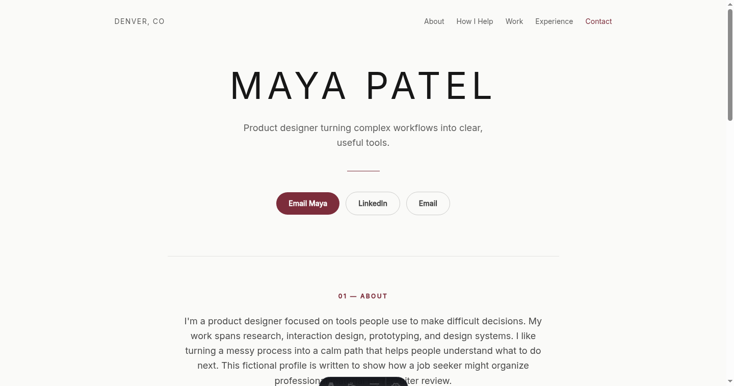
Fictional example. Maya Patel and every detail in this profile were invented for comparison. 01Editorial Light
A restrained layout for research, design, writing, and strategy roles where the work should lead.
- Opening
- A short positioning line says what kind of product designer Maya is.
- Evidence
- Selected projects appear before a long work history can take over the page.
- Reading pattern
- Generous spacing makes the site easy to scan in a quiet, linear order.
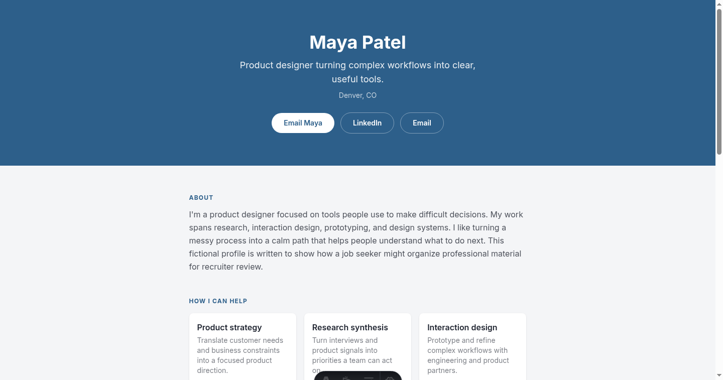
Fictional example. Maya Patel and every detail in this profile were invented for comparison. 02Corporate Timeline
Useful for experienced candidates and career changers whose progression helps explain the next move.
- Opening
- The current professional direction comes before the chronology.
- Evidence
- Roles and dates make career continuity easy to inspect.
- Reading pattern
- A timeline gives each step a clear place without copying a resume line for line.
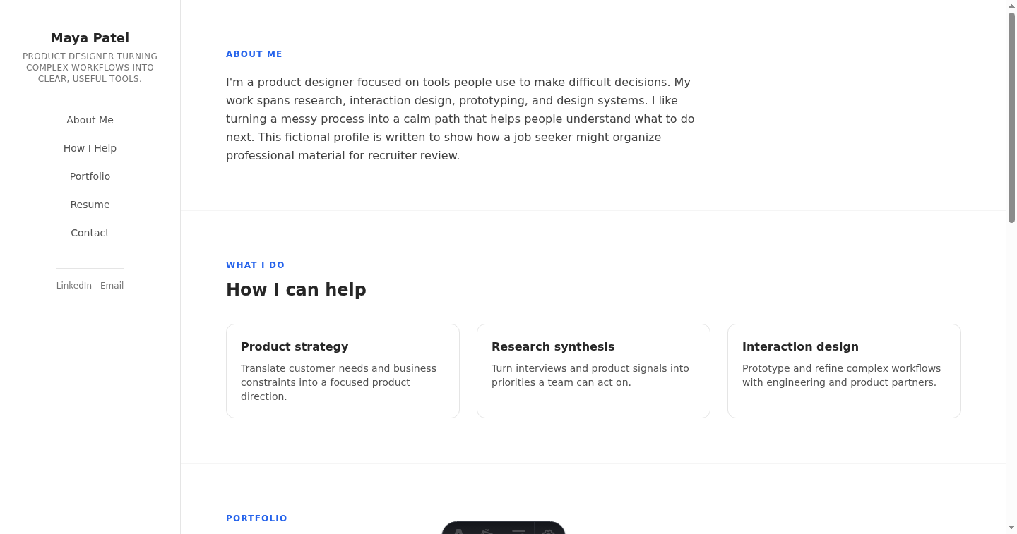
Fictional example. Maya Patel and every detail in this profile were invented for comparison. 03Sidebar vCard
A compact option for generalists who need identity and contact details beside deeper evidence.
- Opening
- Core identity stays visible in a stable side panel.
- Evidence
- The wider column gives projects and experience room to breathe.
- Reading pattern
- Recruiters can orient quickly, then decide where to read more deeply.
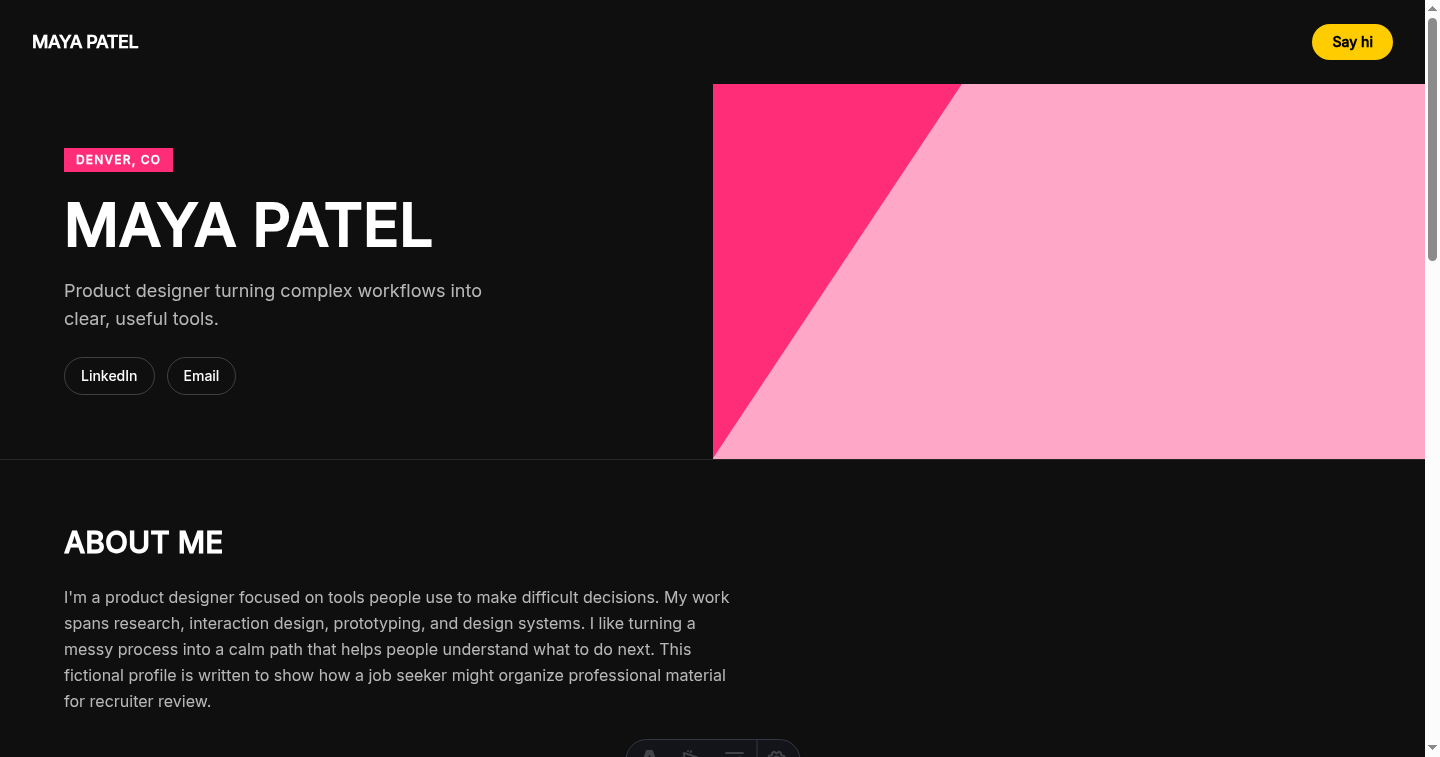
Fictional example. Maya Patel and every detail in this profile were invented for comparison. 04Bold Duotone
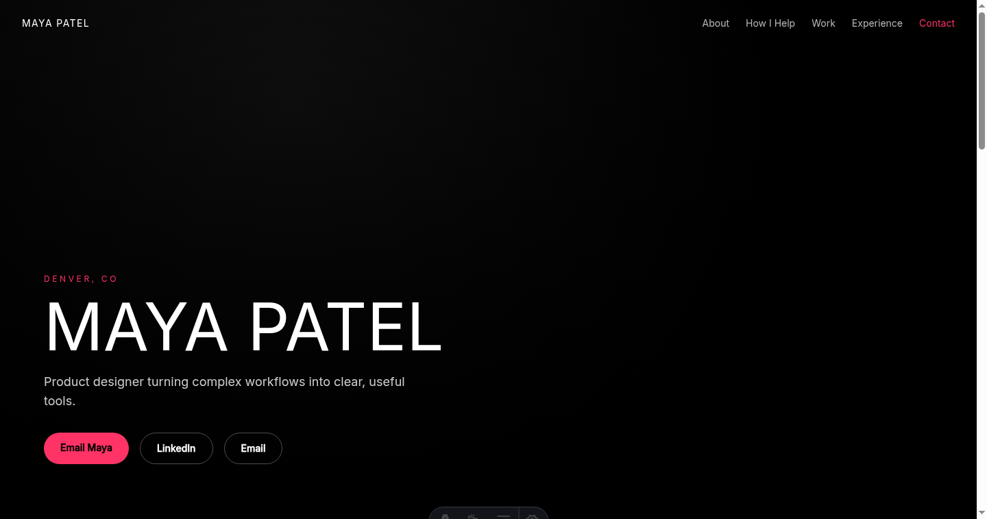
A higher-energy direction for creative, brand, marketing, and product candidates with a focused point of view.
- Opening
- The headline is brief enough to hold a large visual treatment.
- Evidence
- Plain project descriptions keep the stronger style grounded.
- Reading pattern
- A clear visual sequence moves from promise to work without adding decorative sections.
Fictional example. Maya Patel and every detail in this profile were invented for comparison. 05Warm Personal
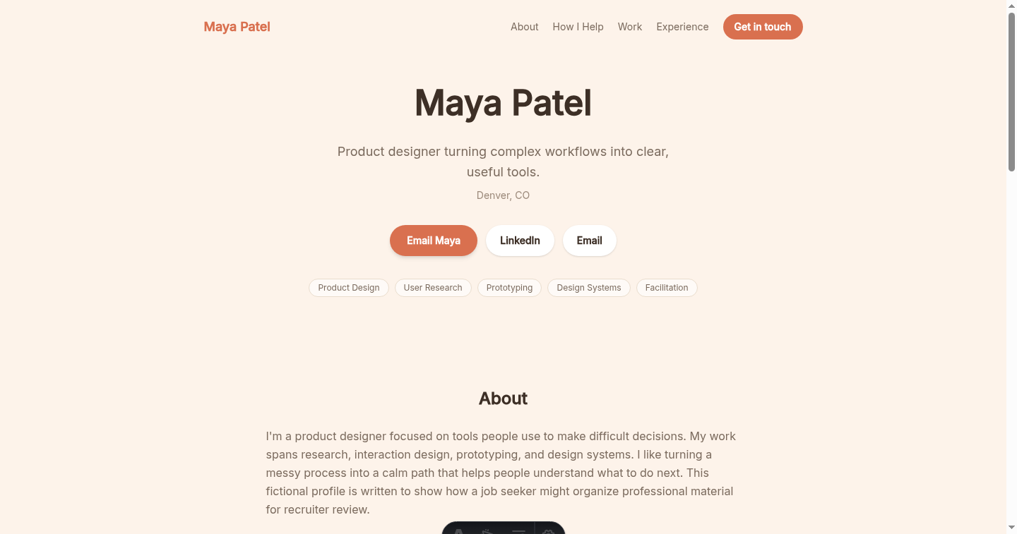
A more conversational fit for education, people, community, service, and relationship-led roles.
- Opening
- The introduction can show approach as well as professional direction.
- Evidence
- Experience and selected work still do the factual work underneath the tone.
- Reading pattern
- Softer cards separate ideas without making the page feel like a document.
Fictional example. Maya Patel and every detail in this profile were invented for comparison. 06Photo Hero
Best when a current professional portrait is genuinely useful for a public-facing role.
- Opening
- The portrait and positioning share the first screen.
- Evidence
- Projects and experience remain below instead of being squeezed into the hero.
- Reading pattern
- The visual introduction is immediate, while the rest of the page stays structured.
Fictional example. Maya Patel and every detail in this profile were invented for comparison. 07Split Photo
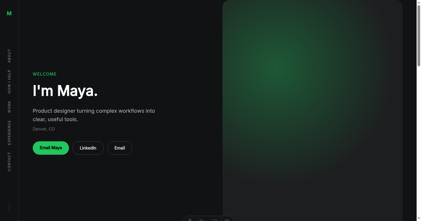
A strong introduction for leaders, speakers, and candidates whose presence is part of the role.
- Opening
- The split layout gives equal space to identity and professional direction.
- Evidence
- The next section can carry detailed work without crowding the opening.
- Reading pattern
- One decisive first screen leads into a calmer supporting narrative.
Fictional example. Maya Patel and every detail in this profile were invented for comparison. 08Neon Glow
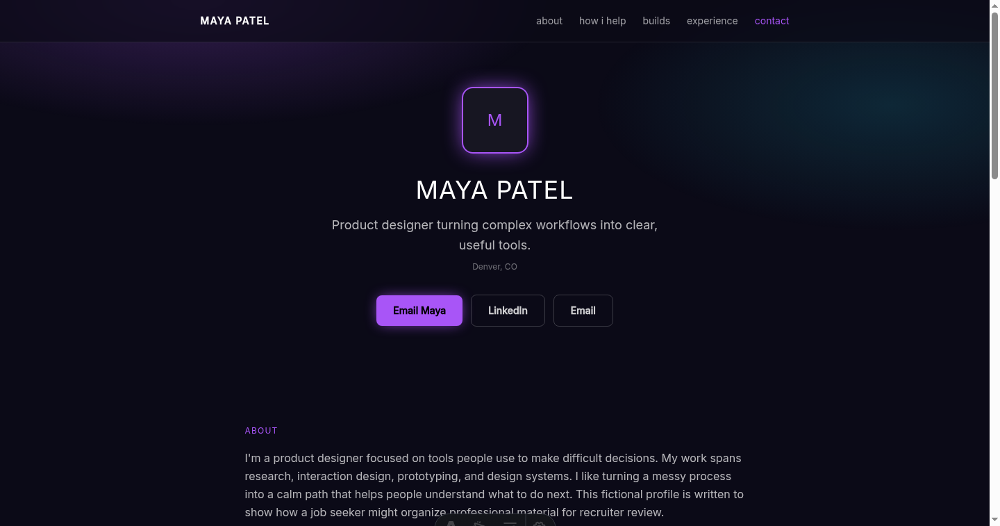
A distinctive digital treatment for technical, engineering, product, and innovation roles.
- Opening
- A direct headline keeps the visual style from obscuring the job story.
- Evidence
- Projects and skills show the work behind the digital presentation.
- Reading pattern
- Bright accents guide attention while the underlying sections stay conventional.
Before you share
Review the site in five quick passes.
Public portfolio-review posts by John Isaac and Karl Askill point to overlapping checks: relevance, presentation, trust, communication, role-specific curation, and evidence of impact. Two perspectives are not a universal recruiter scorecard, but they make a useful final scan.
- 01
Check the role fit
Can someone tell which role you want and why the work you chose is relevant to it?
- 02
Lead with the strongest relevant work
Put the best-matched example early. Curate for this role instead of asking every project to compete for attention.
- 03
Make your contribution and impact clear
Separate what you did from the team's work, then show an achievement or effect you can explain and defend.
- 04
Show the person behind the work
Use your introduction and project explanations to make your thinking and communication easy to follow.
- 05
Test the contact action
Make sure the next step is obvious, the destination works, and no other button competes with it.
Add context, not padding
Turn resume lines into useful evidence.
A website earns its place when it answers the questions a short bullet leaves open.
Resume line
Led redesign of a multi-step planning flow.
Website expansion
Show the problem, the workflow you changed, your role, and one artifact you are allowed to share.
Resume line
Created a research repository for product teams.
Website expansion
Explain what was difficult to find before, how you organized the system, and how teammates used it.
Resume line
Worked with product and engineering partners.
Website expansion
Describe one decision you shaped with those partners and the tradeoff the team had to resolve.
Edit with restraint
What to leave out.
Public space is not a reason to publish every detail. A shorter, safer page is often easier to understand.
- 01Confidential employer, client, or candidate information.
- 02Results you cannot verify or explain.
- 03Every project you have ever touched.
- 04A biography that repeats your full work history.
- 05Several equally prominent contact buttons.
What happens next
- 1. Add your source. Upload your LinkedIn PDF, plus optional links or context.
- 2. Review in private. Check the writing, contact action, and all eight designs.
- 3. Publish when ready. Your draft stays unavailable to the public until you choose Publish.
Build the site your resume cannot be.
Storypage turns material you provide into an editable private draft. You decide what is accurate, which design fits, and whether anything should become public.
Build my private job-search site