Eight personal website templates
Choose the template by the story you need to tell
A personal website is not improved by picking the loudest design. Compare eight professional templates by the evidence you have, the reader you need to help, and the next step you want them to take.
Updated August 10, 2026
You found Storypage through CurlShip. Your draft stays private while you review it.
Start with your LinkedIn PDF. Review the writing and switch designs before anything is public.
Start with the content
The best template makes the right evidence easy to notice.
01 · READER
Who opens the link?
A client reviewing a proposal needs different cues from a recruiter checking career depth or a reader discovering your writing.
02 · PROOF
What proves the claim?
Projects, writing, recommendations, experience, and skills each deserve a layout that helps a reader scan without losing context.
03 · ACTION
What should happen next?
One clear contact or follow-up action is more useful than a collection of buttons asking the reader to make sense of your goals.
The complete template set
Eight designs. One professional structure underneath.
Every design can present the same core profile material, but each changes what feels prominent first. The previews below use fictional content so you can judge the structure without mistaking a demo for customer proof.
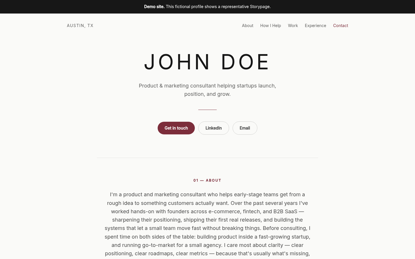
FOR CLEAR THINKING
Editorial Light
Best for: Consultants, strategists, writers, and experienced specialists.
Editorial Light gives the page the calm rhythm of a well-edited profile. A strong headline arrives first, followed by readable sections for your point of view, selected work, experience, writing, and contact details. It is a useful default when the words and evidence should carry more weight than visual effects.
Choose it when you have substantial professional material and want the reader to move through it without distraction. It also works well when you expect a proposal recipient, recruiter, or collaborator to scan the page before deciding what to open next.
Preview the fictional design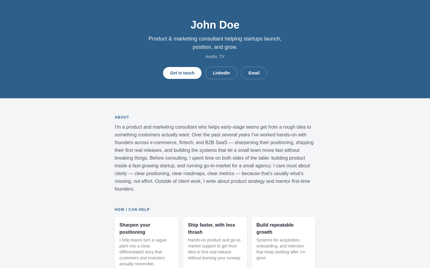
FOR CAREER PROGRESSION
Corporate Timeline
Best for: Executives, operators, advisors, and job seekers with a clear career arc.
Corporate Timeline makes sequence visible. Roles, milestones, and projects feel connected rather than scattered across a conventional resume. The design keeps a formal tone while leaving room for a concise introduction, skills, proof, recommendations, and a direct next step.
Choose it when the order of your experience helps explain your credibility. If a reader needs to understand how one role led to the next, or how your scope grew over time, the timeline becomes part of the story rather than a decorative device.
Preview the fictional design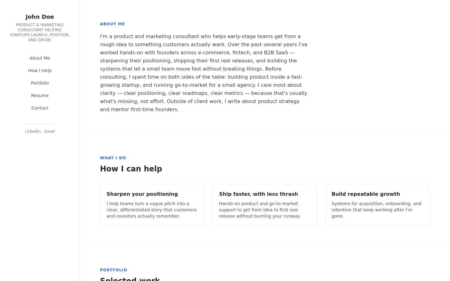
FOR QUICK ORIENTATION
Sidebar vCard
Best for: Freelancers, fractional leaders, coaches, and people with several contact routes.
Sidebar vCard keeps identity and contact information anchored while the main story scrolls beside it. The format feels compact and practical, which helps readers who want to confirm who you are, what you do, where you are based, and how to reach you without hunting through the page.
Choose it when contactability is central to the page. It is especially helpful for independent professionals whose services, work samples, social profiles, and primary contact action all matter, but who still need enough room to explain the work behind those links.
Preview the fictional design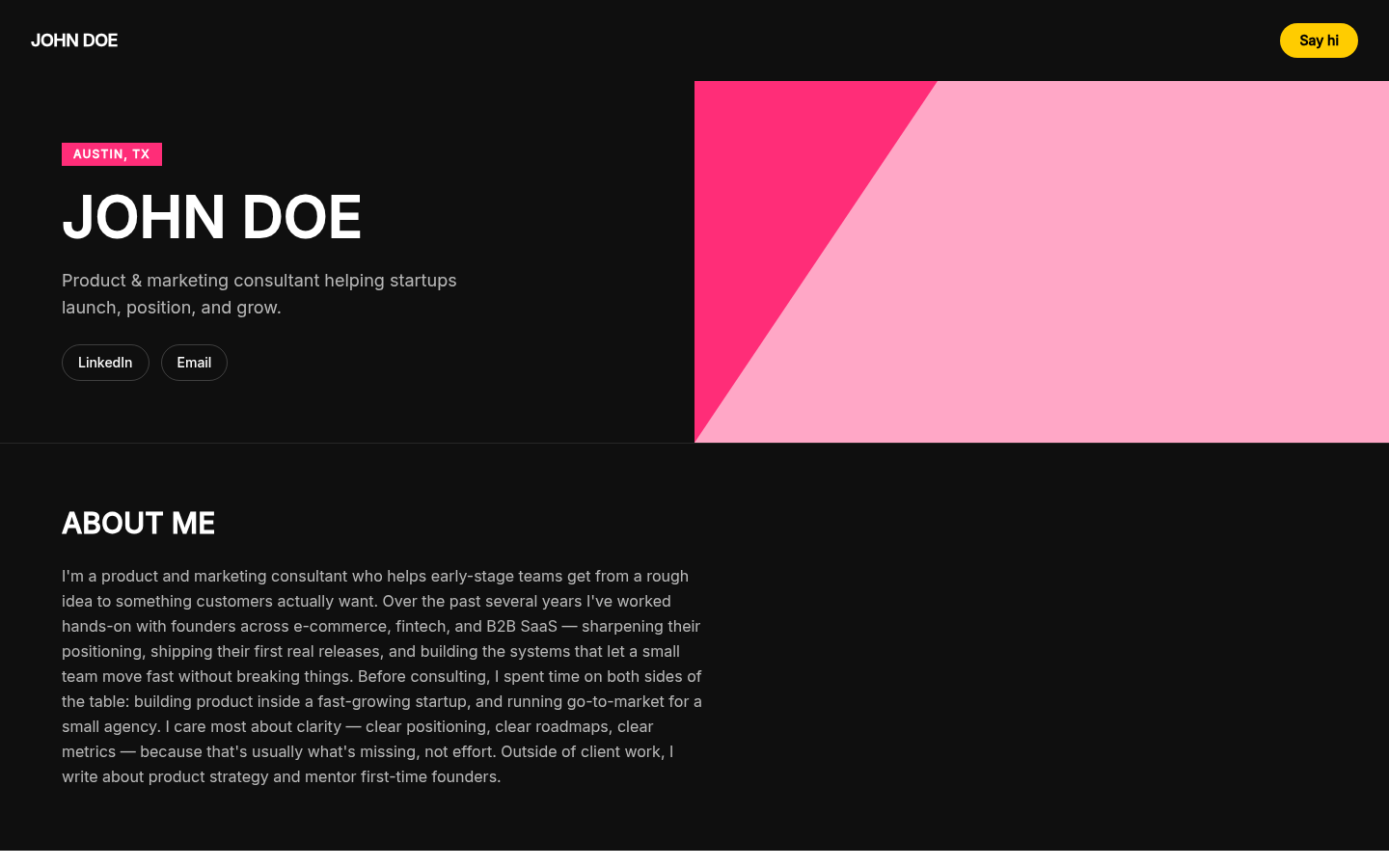
FOR A STRONG POINT OF VIEW
Bold Duotone
Best for: Creative strategists, founders, marketers, and independent experts.
Bold Duotone gives the headline and section transitions more visual force. The layout still supports the same professional proof as the quieter designs, but its contrast makes a sharper first impression. It suits a person whose voice and positioning are already distinctive and should feel that way immediately.
Choose it when restraint would hide too much of your personality. It works best with a short, specific headline and a small number of strong projects. If every section is equally loud or the copy is still vague, the design cannot create focus for you.
Preview the fictional design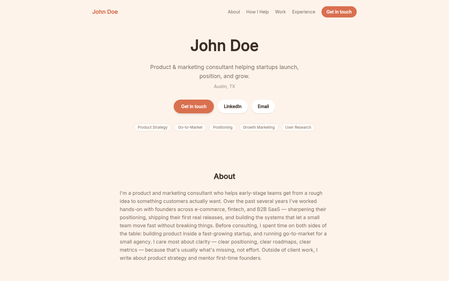
FOR APPROACHABLE EXPERTISE
Warm Personal
Best for: Coaches, educators, community builders, people leaders, and client-facing advisors.
Warm Personal softens the edges of a traditional professional profile. Rounded forms, generous spacing, and a more conversational rhythm make room for both competence and character. It can hold services, selected work, recommendations, writing, and experience without making the page feel like a corporate biography.
Choose it when trust depends partly on how it feels to work with you. The design is a good match for relationship-led work, but the copy should still be concrete. Warmth works best when it surrounds specific evidence rather than replacing it.
Preview the fictional design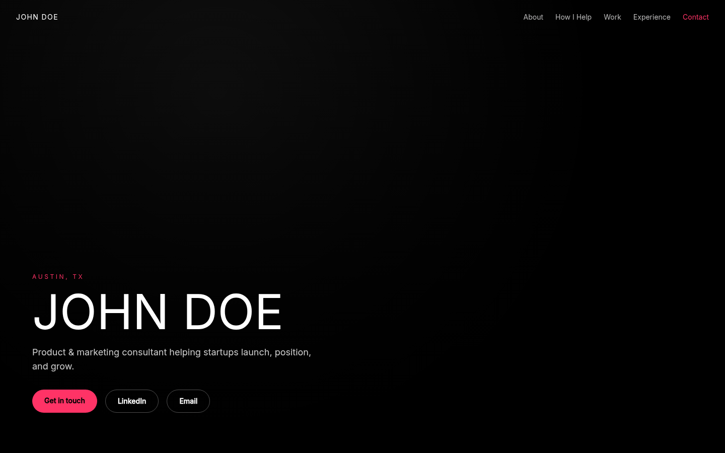
FOR A RECOGNIZABLE FACE
Photo Hero
Best for: Speakers, coaches, creators, advisors, and public-facing leaders.
Photo Hero gives a portrait meaningful space at the top of the page while keeping the professional promise close beside it. The rest of the site moves into proof, experience, recommendations, and contact information. It is personal without turning into a social profile or an image-only portfolio.
Choose it when people often meet you before they meet your work: on stage, in workshops, on video, or through a referral. Use a clear, current image you are comfortable publishing. If you do not have one, a text-led design will usually feel more intentional.
Preview the fictional design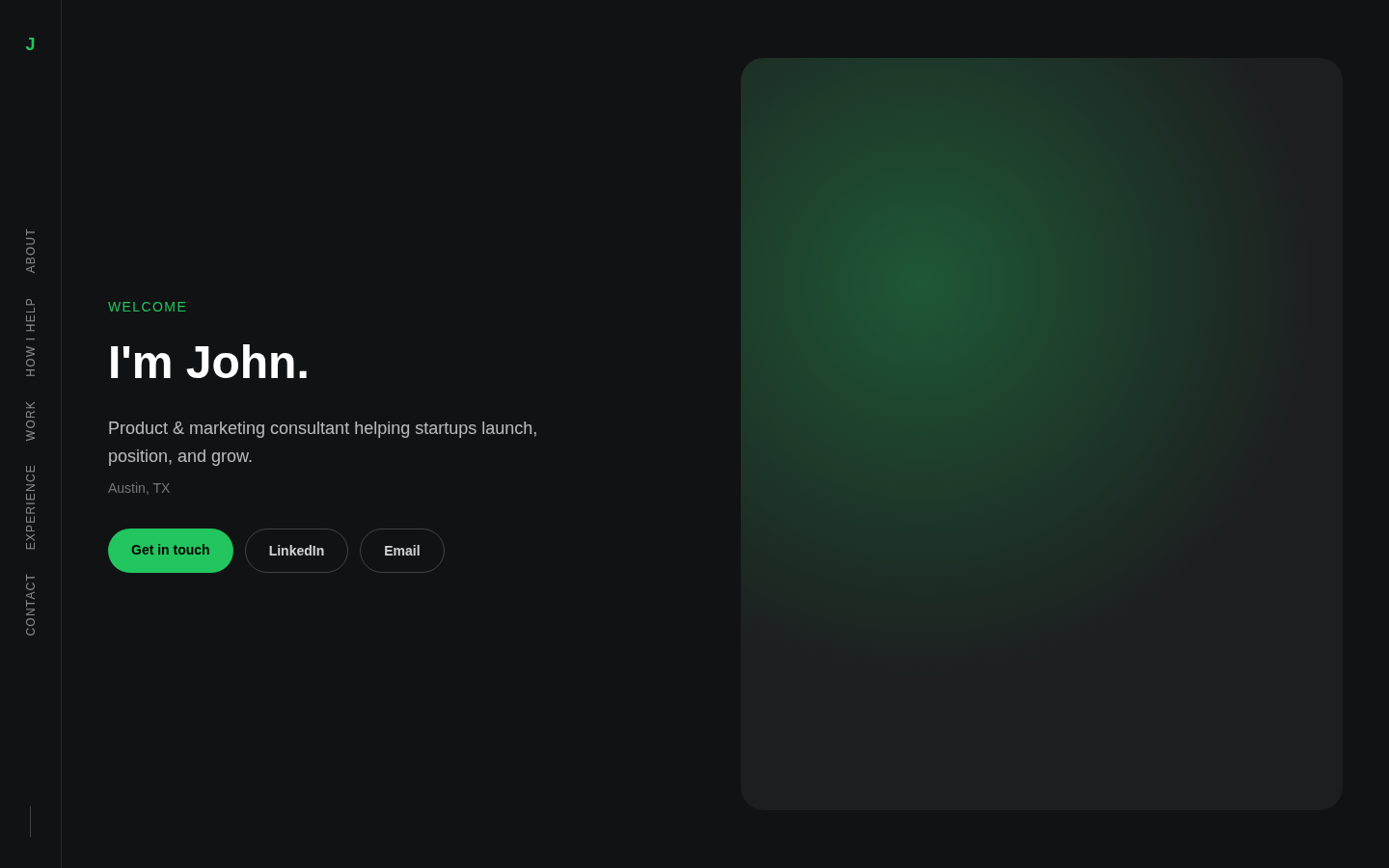
FOR IMAGE AND EVIDENCE
Split Photo
Best for: Consultants, designers, photographers, facilitators, and portfolio-led professionals.
Split Photo balances a strong image with enough room for a precise professional introduction. Neither side has to carry the entire page. The layout creates a visual opening, then supports the detailed material a serious reader needs: services, work, writing, recommendations, experience, and contact details.
Choose it when an image adds context but should not overwhelm the substance. It can suit a professional portrait, an environmental image, or a restrained piece of visual work. The best image explains something about your practice instead of acting as generic decoration.
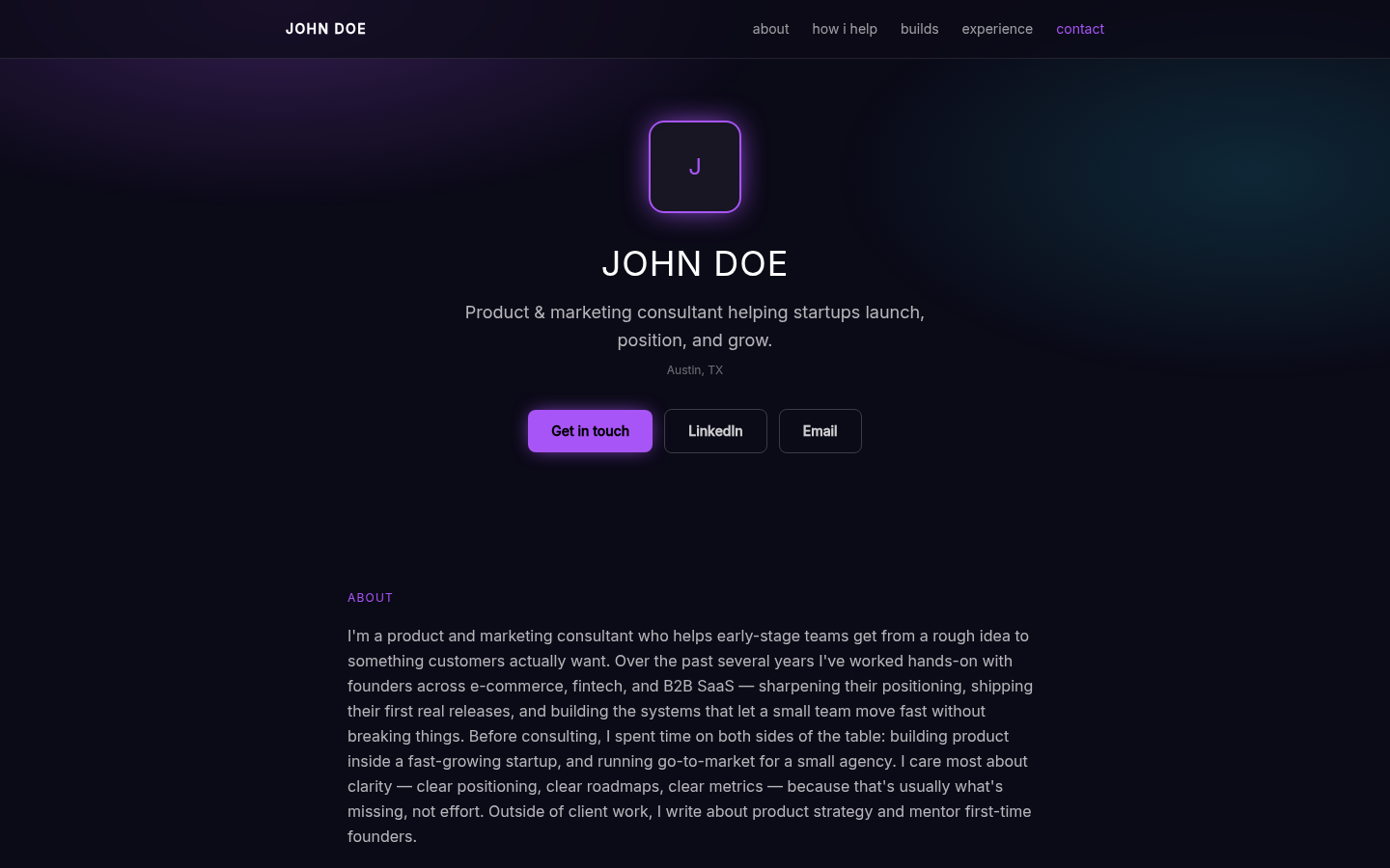
Preview the fictional designFOR TECHNICAL ENERGY
Neon Glow
Best for: Developers, AI specialists, technical founders, and digital creators.
Neon Glow uses a dark field and luminous accents to create a more technical, digital tone. The structure remains professional and readable, so projects, skills, experience, writing, and recommendations do not disappear behind the styling. It is expressive, but it is not a novelty landing page.
Choose it when the visual language fits the work you already do. Technical and creative audiences may read it as confident and current. For conservative buyers or traditional roles, Editorial Light or Corporate Timeline may communicate the same evidence with less visual friction.
Preview the fictional designA practical shortcut
Choose by the decision your reader is making.
Do not begin with color, trend, or industry stereotypes. Begin with the question the page must answer quickly, then choose the design that gives that answer the clearest stage.
YOUR READER'S QUESTION
A proposal recipient needs proof fast
START WITH
Editorial Light
WHY
Clear hierarchy for positioning, selected work, and contact
YOUR READER'S QUESTION
Your career progression is the story
START WITH
Corporate Timeline
WHY
Roles and milestones become an understandable sequence
YOUR READER'S QUESTION
Being easy to contact matters most
START WITH
Sidebar vCard
WHY
Identity, location, links, and contact stay easy to find
YOUR READER'S QUESTION
Your point of view should feel distinctive
START WITH
Bold Duotone
WHY
High contrast gives a concise message more presence
YOUR READER'S QUESTION
Trust grows through warmth and rapport
START WITH
Warm Personal
WHY
A softer tone supports relationship-led work
YOUR READER'S QUESTION
Your face is part of your professional presence
START WITH
Photo Hero
WHY
A portrait leads without crowding out the evidence
YOUR READER'S QUESTION
One strong image helps explain the work
START WITH
Split Photo
WHY
Visual context and professional detail share the opening
YOUR READER'S QUESTION
Your work belongs to a technical or digital world
START WITH
Neon Glow
WHY
A dark, energetic frame matches that context
What belongs on the page
A useful template is a container for proof, not a substitute for it.
A polished shell cannot rescue a generic headline or unsupported claim. Before you choose a visual direction, make sure the page can answer six practical questions. If you need help producing the first draft as well as choosing the design, read how an AI portfolio website builder should handle your source material and review boundary.
- 01
What do you want to be known for?
Lead with a specific professional promise, role, or area of expertise. A headline should help the right reader recognize relevance before they study your history.
- 02
What can you help with?
For consultants and freelancers, name the services or problems you handle. For job seekers, make the target role and useful strengths understandable without copying a job description.
- 03
Where is the evidence?
Use selected projects, work samples, writing, recommendations, or source-backed outcomes. Explain your own contribution instead of claiming a team result as a personal one.
- 04
What context does a resume or profile miss?
The About section should connect the facts, not repeat them. Use it to explain your approach, the thread across your experience, or the kind of work you want to do next.
- 05
What should stay out?
Remove stale roles, weak projects, duplicated claims, private client details, and sections that exist only because the template offers them. Empty space is better than filler.
- 06
What is the next step?
Give the reader one clear contact destination or action. The site should make a conversation easier to begin, not create another maze of choices.
When Storypage is the better fit
You want help shaping the first professional story.
Storypage starts with a required LinkedIn PDF and optional context, links, work samples, and headshot. It generates an editable private draft, then lets you move among all eight designs while you check the facts, rewrite sections, change colors, and decide what belongs.
Saving a draft does not publish it. The public page opens only when you choose Publish, and later draft changes stay separate from the current live version until you publish again.
When another builder is the better fit
You need a website system, not a professional profile.
Choose a general website builder when you need ecommerce, a large blog or publication, custom code, detailed animation, complex forms, many landing pages, or complete control over a multi-page information architecture. Storypage is deliberately narrower.
If you want to arrange every element of a flexible one-page site, read the Carrd alternative guide. If the goal is routing an audience among social and creator links, the Linktree alternative guide is the more honest comparison.
From template to finished site
Design comes after the first draft, so you can judge it with real content.
Bring the source
Upload your LinkedIn PDF. Add a headshot, links, work samples, or professional context only when they help.
Review the draft
Check the writing and claims. Add, edit, reorder, or remove the sections and proof that the reader will see.
Choose and publish
Switch among all eight designs in private. Publish only after the content and presentation are ready.
Questions before you choose
Personal website template FAQ
What should a personal website template include?
It should make room for a clear headline, an About section, selected work or projects, relevant experience, skills, useful writing or recommendations when available, and one obvious contact path. You do not need every possible section. You need the sections that help your reader decide whether the next conversation is worthwhile.
Can I change my Storypage template after the first draft?
Yes. You can switch among all eight designs during private review. Changing a design does not publish the draft, and the public site changes only after you publish the reviewed version.
Do I need a headshot for a personal website?
No. A headshot is optional. Photo Hero and Split Photo work best with a strong image, while the other six designs can lead with your professional story. Choose a text-led template instead of forcing a weak or outdated photo into the page.
Should a consultant and a job seeker use the same template?
They can. The decisive difference is usually the content and contact action, not the template name. Consultants may emphasize services, selected work, recommendations, and a proposal follow-up. Job seekers may emphasize a target role, contribution to projects, relevant skills, and a recruiter contact path. Compare the consultant website examples with the resume website examples to see how the same eight designs support different decisions.
When is Storypage not the right personal website builder?
Storypage is not a general-purpose website builder. Use another platform when you need ecommerce, a large publication, custom code, detailed animation, complex forms, or complete control over a multi-page site. Storypage is designed for one professional story and a clear contact path.
Choose with your own content on the page
Turn your LinkedIn PDF into a private draft, then try all eight designs.
Review the writing, keep only the proof you can support, and publish when the page feels ready to represent you.